Using Python in RStudio to Visualize MLB Home Run Rates
RStudio version 1.2 comes with built in support for python using the reticulate package. This is a quick write up of my set up process in Ubuntu, as well as a simple visualization of MLB batting data using R and Python in the same notebook.
Setting up the virtual environment
I have been using Pipenv for managing my python packages and virtual environments, and the reticulate documentation includes instructions on how to use previously save environments within RStudio. The reticulate::virtualenv_list() lists all virtual environments saved in a specific location. By default, it looks in ~/.virtualenvs, but this behavior can be changed by defining the system environment variable WORKON_HOME as any other file location. In Ubuntu, I found the easiest way to do this was adding the variable to my /etc/environment file, then logging out and back in. Once I did this, running the reticulate::virtualenv_list() command displayed my saved environments. I then specified which to use with the function reticulate::use_virtualenv(). After this, I could now import the various python packages installed in that environment. And if I need to install additional packages, I can use the Terminal pane and quickly install packages with pipenv.
Using Python
With the environment setup, we can now use the pybaseball package to pull 10 seasons of batting data from baseball-reference.com.
import pandas as pd
from pybaseball import batting_stats_bref

def get_batting(year):
    df = batting_stats_bref(year)
    df['year'] = year
    return df

df = pd.concat([get_batting(year) for year in range(2010, 2020)], ignore_index=True)
We can then reference the data in R with the following code. Note, the library reticulate must be loaded or the py object will not be recognized.
library(reticulate)
batting <- py$df
The home run rate this season is higher than it has ever been in MLB history. We can create a visualization of the HR rate per plate appearance over the last 10 seasons.
hr_rate <- batting %>%
  group_by(year) %>%
  summarise(
    HR = sum(HR),
    PA = sum(PA),
    HR_PA = HR / PA
)

ggplot(hr_rate, aes(year, HR_PA)) +
  geom_line(color = "#00369C") +
  labs(title = "MLB HR Per Plate Appearance",
       subtitle = "2010 - 2019",
       y = "HR per PA") +
  scale_x_continuous(breaks = 2010:2019) +
  theme(axis.title.x = element_blank())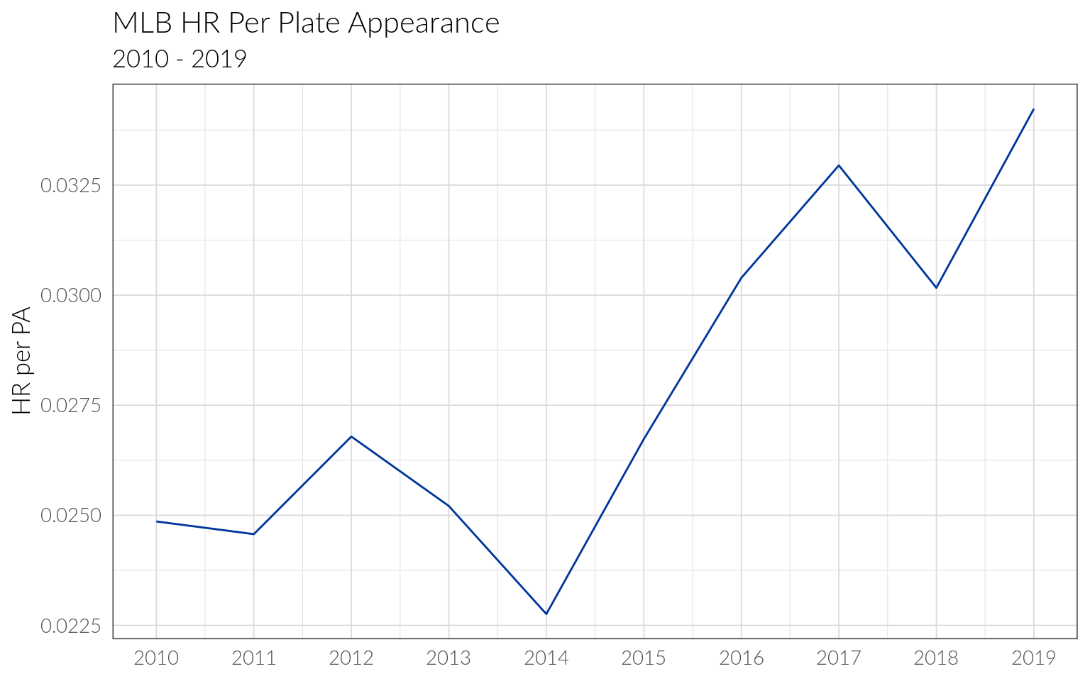
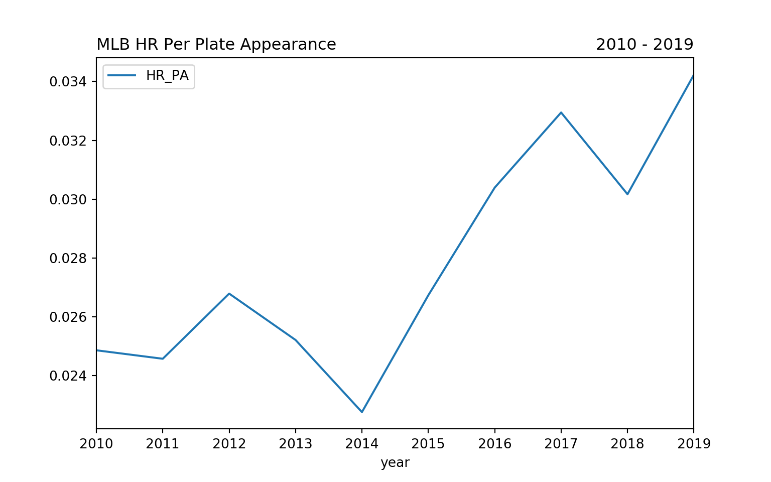
We can then call the summarized data in python to plot the same thing using matplotlib.
import matplotlib.pyplot as plt
df = r.hr_rate

df.plot(kind="line",x="year",y="HR_PA")
plt.title("MLB HR Per Plate Appearance", loc="left")
plt.title("2010 - 2019", loc="right")